 So yesterday morning, Google started rolling out the new redesign of Google+. I’m not going to say it’s better and I’m not going to say it’s worse. I’m just going to say it’s different. There were almost immediately complaints like with all changes to a social network. I’m still hearing how much people hate the Facebook timeline and how the new Twitter interface is useless. I think they both have their merits but am largely in agreement that these were a step back from a user experience. So Google+, after eight months of being open to the public has already given their new social network a facelift. Here are concise summaries of what I think are improvements and things they need to work on.
The Good
Drag and Drop Navigation Management
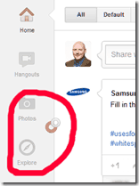 Personally, I’m a fan of the cleaner look. The left hand sidebar has smaller and moveable icons. Just grab the icon and move it in or out of the main navigation and put it as high or low on that navigation as you like. This is pretty cool since everyone has different priorities in terms of what they want to have at their fingertips. As you can see, I’m not much of a Google+ gamer and don’t have much of a need to check out my own profile since I’m not some vain egomaniac. Of course the Home icon stays put – as it should.
Chats and Hangouts are More Prominent
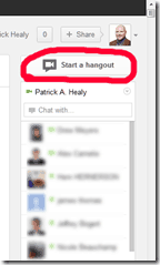 The regular IM chat is noticeably more visible along with the hangout button. The regular IM is integrated into every hangout and makes it easy to start one from IM. Google is definitely pushing the hangout in case you missed every commercial they have ever put on TV. The button is more prominent and in your face. I think this is a good thing because many didn’t even know hangouts existed. I’ve been using them more and more lately and I can say, certain features kill Skype, the generally accepted king of free video conferencing. I did a hangout the other day with 6 people videoing and chatting. We took turns sharing our screens and even added additional folks to the hangout as we needed them. I’ll say this, I like it better and the quality seems to be just as good – if not better at times.
Public Hangouts
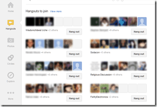 Don’t have any friend logged in but still feel like doing a hangout? (admit it, I inspired you) That’s OK. You can now browse any number of public hangouts that are often about a specific topic. Jump right in and start hangin’. They are really making it easy to use this service.
Easier to Throttle Content
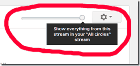 Since the new experience is very much driven by circles, they have displayed a slider more prominently on the top of every circle page so you can determine what speed you want these fire hoses to flow at. This is a good thing if you have people that overshare. Just make a circle for them and dial it down. It doesn’t help if they also fall into circles that you can’t afford to miss anything like family or clients. Your aunt that posts 20 times a day may find herself in your ‘noisemaker’ circle and out of your family circle. That’s not good for circle consistency.
Not Yet in Your Circles
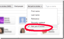 This one is for my friend Joe Sheehan. Although they got rid of what I considered a very cool feature – the Incoming stream that allowed you to take a look at the updates and conversations of those that have you circled but you didn’t reciprocate for one reason or another – they added a pretty cool feature to the circles management utility. You can now sort the people that have you in their circles by recently updated (so you can be sure to connect with someone that actually uses Google+ or people that you haven’t circled just yet. This is pretty good if you just want to look at those people that would have been in your Incoming Stream.
Better Photo Browsing
 It’s no secret that Facebook modeled their photo browsing on how Google does it. I’ve noticed that the Google+ picture galleries are now significantly faster and more animated. They are really stepping up Picasa integration. Perhaps they are pushing media sharing more on this platform. I don’t know but I do like that picture browsing has gotten even better. They have recently made some of these new changes prior to this new design rollout but they must have done them specifically with this in mind. You can hide comments and just flip through pictures which takes a bit of the social out of it but this is definitely more Flickr-like. Not being as good as Flickr has been a frequent complaint about Picasa. They finally seem to be doing something about it.
Grab Your Basket
You are once again able to Picnik – sort of. This one’s for Eleanor Thorne who was just wondering what ever happened to her favorite free photo software. With this new integration finalized, you can do basic size and color adjustments but also have some fun with your photos. They’ve been rolling out cool holiday driven tools since the Fall with the “inconsistent at best’ Creative Kit. Looks like they sorted this out. Now all they need is some better integration with Picasa for desktops and we’re talking about very powerful photo management, adjustment, printing, and sharing for all. That should be worth a few million more users, IMO. Sorry for the James Hetfield style grey beard, Kev. It was you or me. ![]() I think Drew looks particularly dashing though; in a sinister, vaudeville sort of way.
I think Drew looks particularly dashing though; in a sinister, vaudeville sort of way.
No More Dicing Up Scrapbook Photos
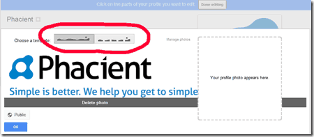 Fortunately there is a silver lining to some of the profile issues I’m about to mention below. You have your option of what kind of image template you want to put in your profile. This means no more dicing up your logo and having lame white bars cutting through your images. This really bothered me for a while and I changed it immediately after I was converted. They must have gotten a ton of feedback on this one.
The Bad
Too Many Albums to Browse
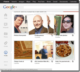 Personally, for whatever reason, I seem to generate a lot of albums on this platform. I organize them better on my computer than up here in Google+/Picasa online. In lieu of seamless integration with your desktop, maybe they could let you consolidate these things into categories. One thing I would be happier about is if they were able to allow you to make album sets where you could put all of your similar albums so you could look at all the pics of things, like Birthdays, all in one shot or album by album while keeping them from cluttering one main albums section.
More Whitespace, Less Information
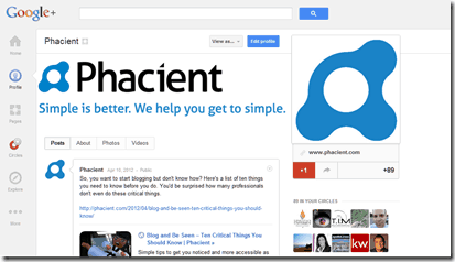
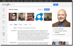 Profile pages are cleaner but more crowded at the same time. It’s weird to say this but I don’t see as much information above the fold as I used to. I don’t know how they pulled this off. Perhaps it’s the gigantic profile pic that they are now showing. I’m considering shrinking mine. That will take care of too much of my mug but won’t recapture me some of that real estate. This is particularly a problem for reviewing things in your stream or managing a business page. Do I need this much logo? Probably not but I also don’t want to contribute to the whitespace brouhaha that’s going on now. This is a challenge that all business page owners need to deal with. I don’t have an answer for you but I think that there may be too much imagery on the page overall.
Your Circles are on Top Now
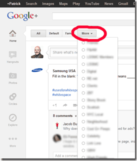 One of the ways they were able to free up so much space is that they took all the circles you made and put them along the top of the page. This is probably a good thing – unless you have a lot of circles like me. I have to scroll down to see all of mine which is much less convenient than the more/less function they used to have.
If You Use Chrome, Your Extensions are Toast
Considering this is such a big facelift, chances are just about any Google+ Chrome extension you use will no longer work. I only use a couple so I’ll deal but I know others like Steph Davis that use a ton of them so they may have a hard time until they get updated. I’m sure it won’t have any long term effects on usage but it’s one of those things that makes people dislike these types of things. Any third party plugin is going to have to scramble to become functional and useful to its current user base. I used Social Fixer for Facebook and with the move to Facebook Timelines it broke that plugin as badly as I’ve ever seen it done. It took longer than it should have to fix so third party developers take note – get on this to avoid losing your people to another, more agile developer.
Notifications are Better Worse Better
 I am not really sure how I feel about this so I’m leaving it at the end. Since your circles are on a top navigation there is no need for the Notifications link to be right below them. The red notification box is really all you have here. On the one hand, this box is really easy to carry on conversations in and respond to – and then get out quickly. On the other hand you won’t get the same experience that you will if you click the ‘View all notifications’ link. I find myself still clicking it and this is the only place I can find it.
Conclusions
I think Google’s development and design method is sound. They take in user data and feedback objectively and seriously. They are in the business of making things work. As Read Write Web said yesterday, Google+ IS Google now. If you activate your Google+ account then you are part of it regardless of whether you go to plus.google.com or not. When you are logged in and uploading content to any of their tertiary services or +1-ing someone’s blog post (feel free to do that here BTW), you are contributing to this network and it will pay dividends for everyone.
Is your business on Google+ yet? It’s not nearly as hard to have a nice page as it is on Facebook since it’s so new. There are no overly complicated apps yet. The learning curve has been reset to zero. This is your time to come in and not be behind in the race. If you don’t have a community built yet, I’d be looking to do it here. I know a great little company that can help you with that. ![]() What are you feelings on the new redesign? I am sure I haven’t covered it all.
What are you feelings on the new redesign? I am sure I haven’t covered it all.
-PH

Thanks Patrick 🙂